Must-Follow Design Tips and Tricks for Using Large Format Print in Your Space
Great design is arguably the single most important aspect of a beautiful printing project. But, there’s a lot to keep in mind when designing for large-format printing. The bigger the project you’re looking to create, the more important it becomes. Most large-format prints are displayed in public areas that people are hurriedly travelling past.
You only have a brief moment to share your message and impact the viewer. If the viewer doesn’t immediately understand what you’re conveying, chances are they won’t spend the time trying to unravel its meaning.
Capture Their Attention- Keep Your Design Simple
When starting your design, you’ll likely have a million creative ideas rushing through your mind. But to produce an effective piece, it’s important to limit yourself to one or two central themes. While your design can still be unique and interesting, simple shapes and messaging will make your design much easier to understand quickly.
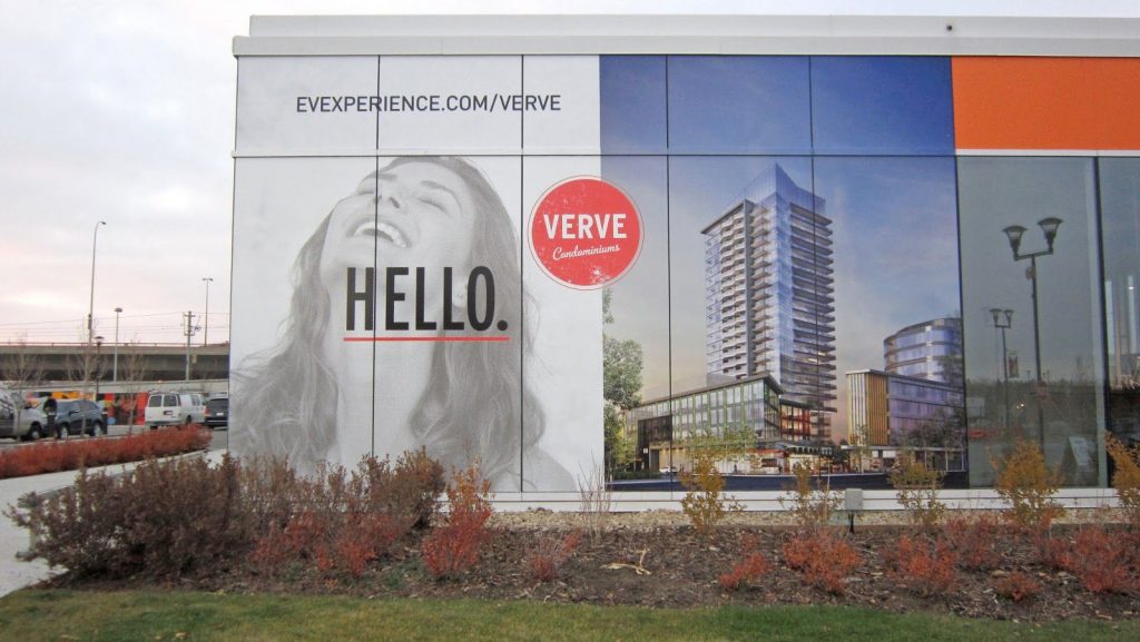
Take the above vinyl exterior printed for Verve. It includes a clear central image of condos (what’s being sold), a clear call out “Hello” (to capture your attention), the brand, and a website URL. It’s not overly complex which makes it easy to see what’s being marketed, even when only glanced at.
Keep it Clear- Make Your Design Easy To Read
As we mentioned already, viewers of your large-format print are likely only going to see it briefly as they pass by. Therefore, the text in your project needs to be easy to read.
When designing for readability, remember to choose simple fonts that don’t have too much creative flair (loops and slants), have appropriate spacing between letters , and a thickness that is easy to read from a distance.
To make your text clear from a distance, you must also consider sizing. For example, from 50 ft away, the text should be a minimum of 125 pts but for 200 ft in needs to be 500 pts.
Make it Sharp- Use Contrast in Your Design
From a distance, it can be difficult to distinguish between overly similar colours, such as a medium grey and light grey. Therefore, when designing for large-format printing it’s best to choose colours with high contrast.
You can either choose colours on opposite sides of the colour wheel such as red and green, place bright colours next to neutrals, or choose something simple like black and white. Ultimately, when you’re designing for a large-format project, it’s best to ask an expert.
The team at ABL is happy to answer all your questions about the design and install of your piece and can provide valuable input on colours, shapes, fonts, materials and more.
Recent Comments